I’ve always believed that walls are more than just boundaries—they’re blank canvases waiting to tell your story. Over the years, I’ve discovered that the right wall painting technique can completely transform a space, turning an ordinary room into something extraordinary. Whether you’re looking to add personality to a rental apartment or planning a complete home makeover, wall painting offers endless possibilities without breaking the bank.
The beauty of wall painting lies in its versatility and accessibility. You don’t need to be a professional artist to create stunning effects that rival expensive wallpaper or intricate tile work. With some patience, the right tools, and a dash of creativity, you can achieve gallery-worthy results that reflect your unique style.
In this guide, I’m sharing 20 inspiring wall painting ideas that range from bold and dramatic to subtle and sophisticated. You’ll discover techniques that work for every skill level, from simple geometric patterns to intricate murals. Each idea comes with practical tips on color selection, application methods, and design considerations to help you achieve professional-looking results.
What excites me most about these techniques is how they can adapt to any aesthetic—whether you’re drawn to modern minimalism, cozy farmhouse vibes, or eclectic bohemian flair. Ready to transform your walls? Let’s dive in and explore these creative possibilities together!
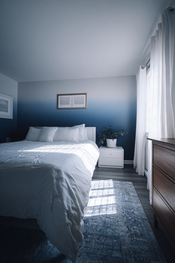
1. Ombre Fade Effect
The ombre fade effect creates a stunning gradient that adds depth and visual interest to any room. This technique seamlessly blends two or more colors from dark to light, creating a dreamy, atmospheric feel that works beautifully in bedrooms and living spaces. I love how it can make ceilings appear higher and rooms feel more spacious.
Start by selecting colors in the same family—think soft blues fading into white or warm peach melting into cream. The key to success lies in blending while the paint is still wet. Use a large brush or roller to apply your darkest shade at the bottom, then work your way up with progressively lighter tones. The magic happens in the middle where colors meet—use gentle, overlapping strokes to create that seamless transition.
Designer tip: Work in small sections and keep a spray bottle handy to lightly mist the paint if it starts drying too quickly. This helps maintain that smooth, blended look.
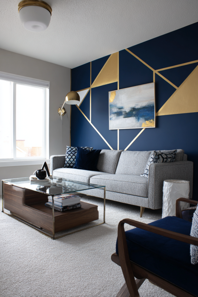
2. Geometric Accent Wall
Geometric patterns bring contemporary sophistication and visual drama to your space. These bold shapes—triangles, hexagons, chevrons, or diamond patterns—create focal points that draw the eye and add architectural interest. I find them particularly effective in modern and mid-century inspired homes.
The beauty of geometric designs is their versatility. You can go bold with contrasting colors like black and white, or keep it subtle with tonal variations of the same hue. Planning is crucial here—use painter’s tape to create crisp, clean lines and map out your pattern before you start painting. Consider the room’s purpose when choosing your design. Sharp angles add energy to workspaces, while softer patterns create calm in bedrooms.
Designer tip: Start with your lightest color as the base, then layer darker shades on top. This approach makes corrections easier if needed.
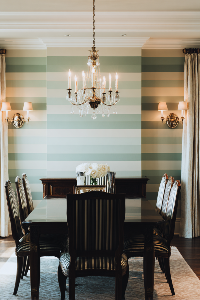
3. Horizontal Striped Walls
Horizontal stripes are my go-to trick for making narrow rooms feel wider and more spacious. This classic technique adds sophistication while playing with visual perception in clever ways. Whether you choose bold, contrasting colors or subtle tone-on-tone variations, stripes bring rhythm and movement to your walls.
For a refined look, I recommend alternating between matte and glossy finishes in the same color—this creates elegant texture without overwhelming pattern. Wider stripes feel more relaxed and casual, while thin stripes add formality. Use a level and painter’s tape to ensure perfectly straight lines. Consider your room’s proportions carefully—stripes can make low ceilings feel even lower if not balanced properly.
Designer tip: Odd-numbered stripe patterns (three or five colors) tend to look more intentional and sophisticated than even numbers.
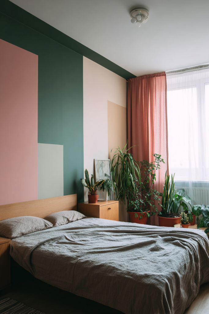
4. Color Block Design
Color blocking brings bold, modern energy to your walls through distinct sections of contrasting colors. This technique, borrowed from fashion and graphic design, creates striking visual statements that feel fresh and contemporary. I love how it allows you to incorporate multiple favorite colors without creating chaos.
The key is choosing colors that complement rather than compete. Start by dividing your wall into geometric sections—rectangles, squares, or asymmetric shapes. Use painter’s tape to mark clean boundaries. Consider the 60-30-10 rule: one dominant color covering 60% of the space, a secondary color at 30%, and an accent color for the remaining 10%. This creates balance while maintaining visual interest.
Designer tip: Keep furniture and decor relatively neutral to let your color-blocked wall be the star of the room.
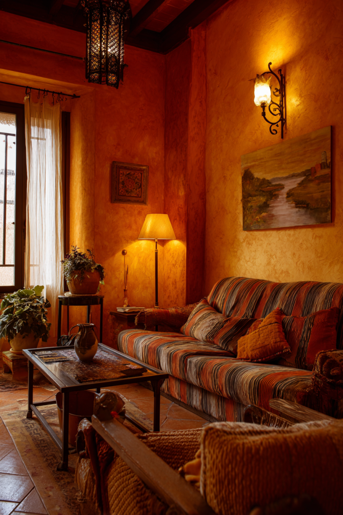
5. Textured Sponge Painting
Sponge painting creates beautiful, organic texture that adds depth and dimension to flat walls. This forgiving technique is perfect for beginners because its natural, mottled appearance hides imperfections while creating sophisticated visual interest. I’ve used it to mimic everything from aged plaster to soft clouds.
Start with a base coat in your lightest color and let it dry completely. Then, using a natural sea sponge (synthetic sponges create less realistic patterns), dab on one or two darker shades. The key is building layers gradually—light applications create subtle texture, while multiple layers add richness. Rotate your sponge frequently to avoid repetitive patterns. This technique works beautifully in earth tones for a Mediterranean feel or soft pastels for romantic spaces.
Designer tip: Practice your technique on cardboard first to find the right amount of paint and pressure before tackling your walls.
6. Stenciled Border Design
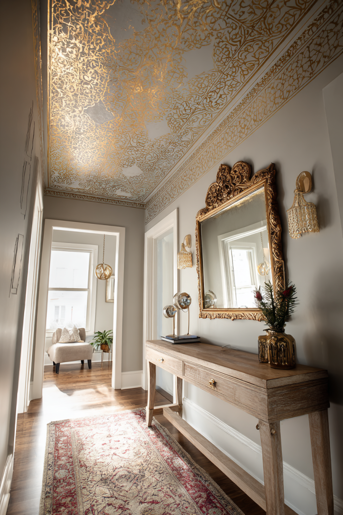
Stenciled borders offer an elegant way to add decorative detail without committing to full-wall patterns. These painted “trim” elements bring architectural character to rooms that lack interesting moldings or wainscoting. I particularly love using stencils to create damask, floral, or geometric borders at ceiling lines or chair rail height.
Choose stencils that complement your room’s style—ornate patterns for traditional spaces, clean geometric designs for modern rooms. Secure your stencil with painter’s tape and use a foam roller or stencil brush with minimal paint to prevent bleeding. Work methodically across your border, carefully repositioning the stencil. Consider metallic paints for added glamour or stay tone-on-tone for subtle sophistication.
Designer tip: Stenciled borders work beautifully to define spaces in open-concept homes, creating visual room divisions without walls.
7. Two-Tone Wall Division
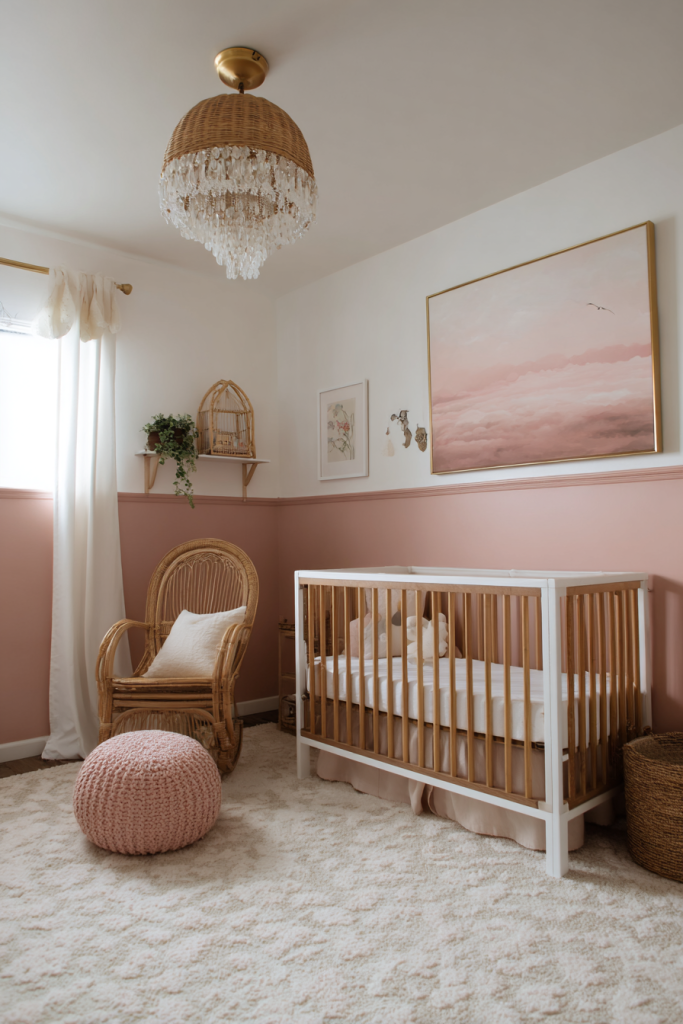
Two-tone walls create visual interest through horizontal color division, typically separating the wall into upper and lower sections. This technique draws inspiration from traditional wainscoting and adds architectural depth to plain walls. I find it particularly effective for making tall ceilings feel cozier or adding character to rental spaces.
The classic division point is one-third up from the floor, but you can adjust based on your room’s proportions. Use darker colors on the bottom to ground the space and lighter shades above to maintain airiness. A chair rail, painted strip, or even decorative trim between the two colors creates a polished finish. This approach works beautifully in dining rooms, hallways, and bedrooms.
Designer tip: If installing actual molding isn’t possible, paint a thin horizontal stripe between your two colors to mimic the look of trim.
8. Mural Statement Wall
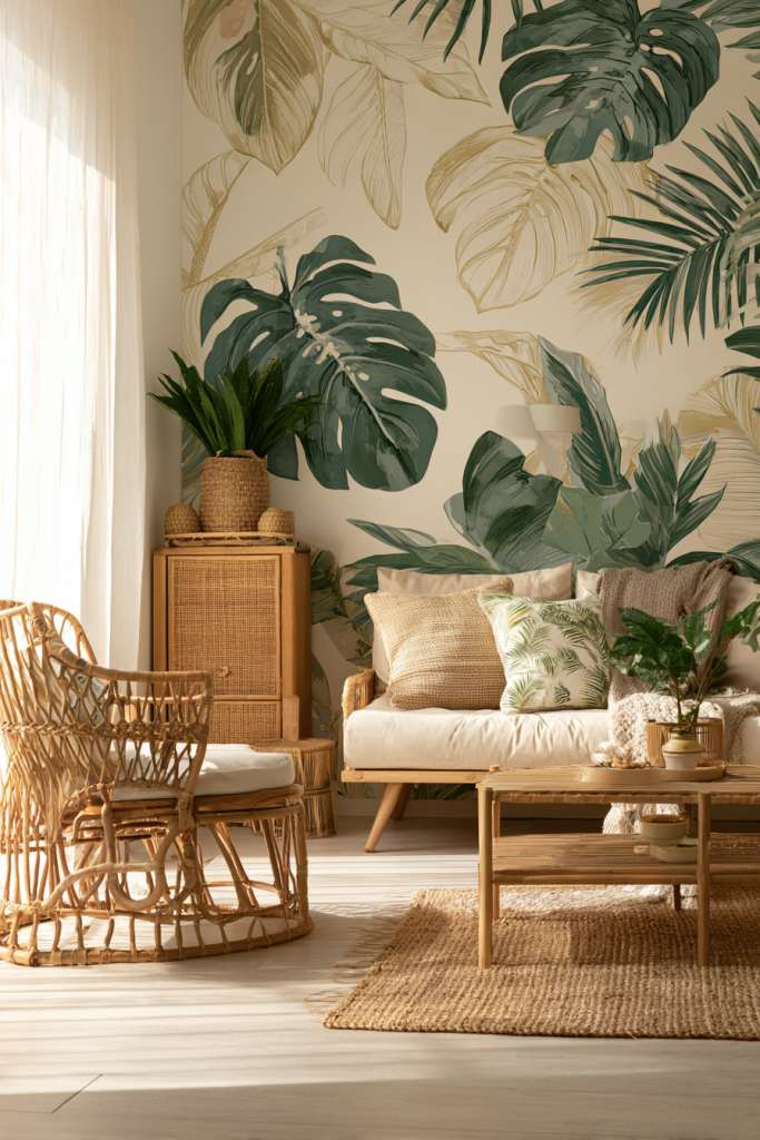
A hand-painted mural transforms your wall into genuine artwork that reflects your personality and interests. While this requires more skill and confidence, the results are truly one-of-a-kind. I’ve seen everything from botanical gardens to cityscape silhouettes create stunning focal points in homes.
Start by sketching your design on paper, then use a projector or grid method to transfer it to your wall. For beginners, consider simple designs like mountain ranges, abstract shapes, or oversized tropical leaves. You can also hire a local artist or use paint-by-number style mural kits. Consider the room’s purpose—calming nature scenes for bedrooms, energizing abstracts for home offices, whimsical illustrations for children’s spaces.
Designer tip: Murals work best on walls without obstructions like windows or doors, giving your artwork uninterrupted space to shine.
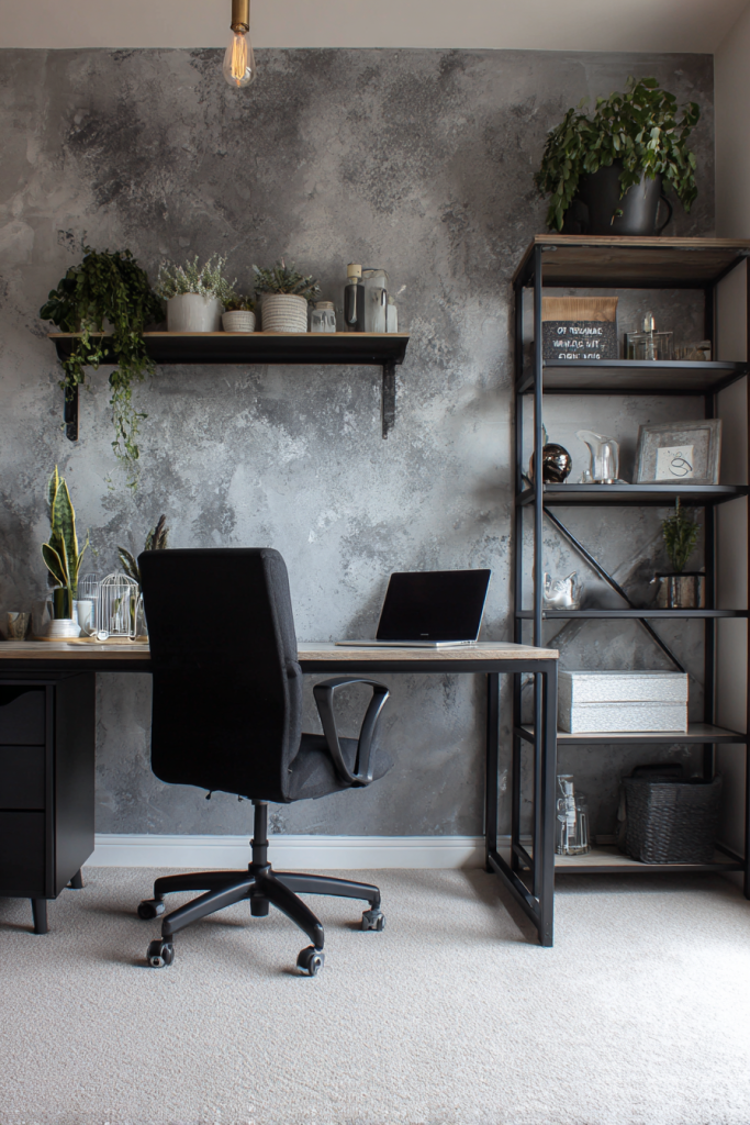
9. Faux Concrete Finish
The industrial faux concrete look brings urban sophistication to residential spaces. This textured finish mimics the appearance of raw concrete walls found in lofts and contemporary spaces, but it’s warmer and more practical than actual concrete. I love how it adds edge to otherwise traditional homes.
Achieve this look using specialized concrete-effect paint or by layering gray-toned paints with joint compound for texture. Apply your base coat, then use a trowel or putty knife to add patches of lighter and darker grays, blending as you go. The imperfect, slightly mottled appearance is part of the charm. Seal with matte varnish for durability. This technique pairs beautifully with exposed brick, metal accents, and minimalist furniture.
Designer tip: Use this finish on just one accent wall to maintain warmth—too much faux concrete can make spaces feel cold.
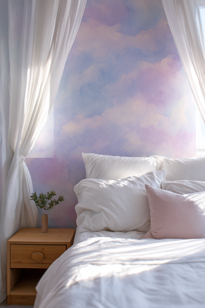
10. Watercolor Wash Effect
The watercolor wash effect brings soft, artistic beauty to walls through translucent layers of diluted paint. This dreamy technique creates ethereal, cloud-like patterns that feel gentle and organic. I find it perfect for creating calming environments in bedrooms, bathrooms, and meditation spaces.
Mix your chosen paint colors with water (about 1 part paint to 3 parts water) to create a translucent wash. Using a large, soft brush or sponge, apply the diluted paint in sweeping, overlapping strokes. Let areas dry at different rates to create natural variation. Layer multiple colors for depth—soft pinks and purples for romantic spaces, blues and greens for tranquility. The key is embracing imperfection; the organic, flowing nature is what makes this technique special.
Designer tip: Work on primed white walls for the best color clarity, and embrace the unpredictable nature of how colors blend and pool.
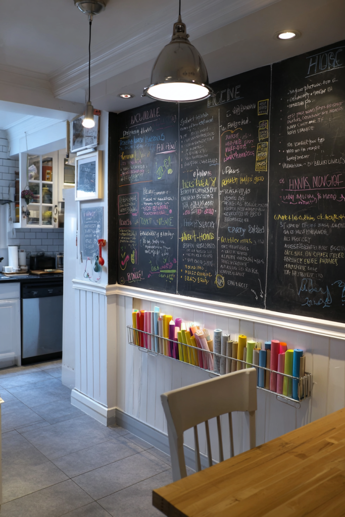
11. Chalkboard Paint Feature
Chalkboard paint transforms any wall into an interactive surface perfect for notes, artwork, and ever-changing decoration. This functional approach works brilliantly in kitchens for grocery lists, home offices for brainstorming, or children’s rooms for creative expression. I love how it adds both practicality and personality.
Apply at least two coats of chalkboard paint to ensure proper coverage and smooth writing surface. Let it cure for three days before using, then condition the surface by rubbing chalk over the entire area and erasing it. Consider framing your chalkboard wall with molding for a more polished look. Color options extend beyond basic black—deep navy, forest green, and charcoal gray offer sophisticated alternatives.
Designer tip: Install a small ledge below your chalkboard wall to hold chalk and erasers, keeping supplies accessible and organized.
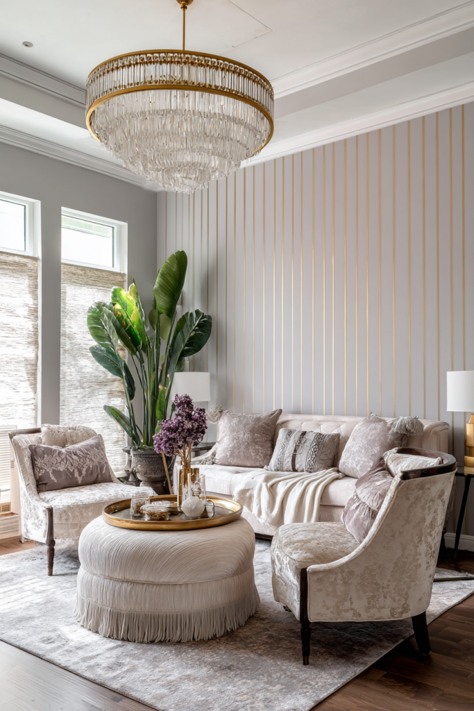
12. Metallic Accent Stripes
Metallic accent stripes add glamour and light-reflecting beauty to any room. These shimmering details catch light throughout the day, creating subtle movement and luxury. I particularly love using metallic stripes to elevate neutral color schemes without overwhelming the space.
Choose a base color first, then add metallic stripes in gold, silver, copper, or rose gold. The width and spacing of your stripes dramatically affect the overall look—thin, closely spaced stripes feel formal and traditional, while wider, spaced-out stripes appear more modern. Use painter’s tape for crisp lines and apply metallic paint with a small roller for even coverage. This technique works beautifully as a full wall treatment or as a border accent.
Designer tip: Limit metallic stripes to one accent wall to maintain sophistication—too much shimmer can feel overwhelming.
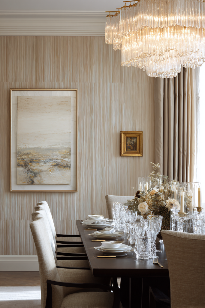
13. Strie or Dragging Technique
The strie technique creates subtle, sophisticated texture through fine vertical lines that add depth without bold pattern. This French decorating method involves dragging a dry brush through wet glaze, creating elegant striations reminiscent of fine linen. I find it perfect for creating understated luxury in formal spaces.
Start with a base coat in your chosen color and let it dry. Mix a glaze with a slightly lighter or darker shade of the same color. Apply the glaze in vertical sections, then immediately drag a dry brush through it from ceiling to floor in one continuous motion. Wipe your brush between strokes for consistent results. This technique adds incredible depth and interest while remaining subtle enough for any decor style.
Designer tip: Work with a partner—one person applies glaze while the other drags, ensuring the glaze doesn’t dry before you create the strié effect.
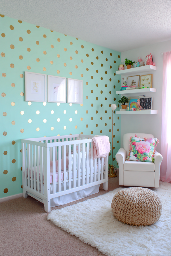
14. Polka Dot Playfulness
Polka dots bring cheerful, whimsical energy to walls while remaining surprisingly versatile. This playful pattern works in children’s rooms, craft spaces, or anywhere you want to inject personality and fun. I’ve seen polka dots executed in ways ranging from youthful and bold to sophisticated and subtle.
Create perfectly round dots using circular sponges, stencils, or even household items like jar lids as templates. Consider your dot size and spacing carefully—larger dots feel bold and modern, while smaller dots create a more delicate, wallpaper-like effect. You can create regular patterns or random placement for an organic feel. Metallic dots on neutral walls add grown-up glamour, while rainbow dots on white bring childhood joy.
Designer tip: Use an ombre effect with your dots, transitioning from darker at the bottom to lighter at the top for added sophistication.
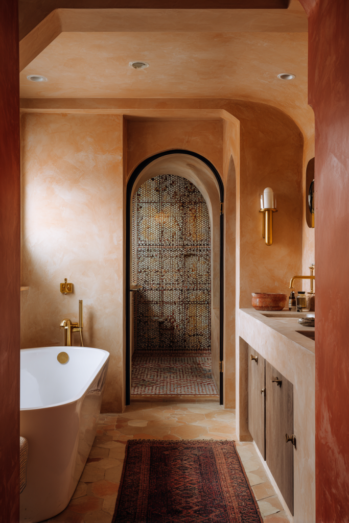
15. Moroccan Tadelakt Inspired
Tadelakt-inspired finishes bring the luxurious, polished plaster look of Moroccan design to your walls. This technique creates a subtle, cloudy effect with slight sheen that feels both ancient and contemporary. I love how it adds warmth and exotic sophistication to bathrooms and bedrooms.
While true tadelakt requires specialized materials, you can achieve a similar look with venetian plaster or textured paint. Apply your base coat, then layer on plaster or thick paint using a trowel in overlapping, circular motions. Burnish with a clean trowel once partially dry for that signature subtle sheen. Earth tones like terracotta, warm ochre, and dusty pink work beautifully, though any color can achieve this effect.
Designer tip: This technique works beautifully in powder rooms and bathrooms where the slight water resistance of burnished plaster is both practical and beautiful.
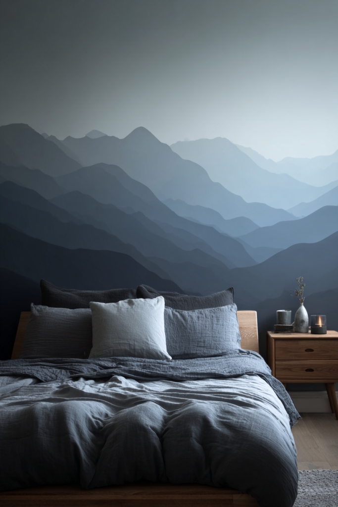
16. Mountain Range Silhouette
Mountain range silhouettes create dramatic, nature-inspired focal points perfect for adventure-lovers and nature enthusiasts. This graphic approach brings the outdoors in while maintaining a modern, minimalist aesthetic. I particularly love this in bedrooms and living spaces where you want to evoke calm and wanderlust.
Start by sketching your mountain range design—you can free-hand for an organic look or use painter’s tape for crisp edges. Paint your mountains in graduated shades from dark in the foreground to light in the background, creating depth through color layering. Consider adding sunset colors, starry skies, or keeping it monochromatic. This technique works on full walls or as a wainscoting-height treatment around the room.
Designer tip: Use at least three different shades to create realistic depth—your closest mountain should be the darkest, with each layer getting progressively lighter.
17. Rag Rolling Texture
Rag rolling creates soft, sophisticated texture through a simple technique that adds visual interest without overwhelming pattern. This method produces subtle, cloudy effects similar to expensive wallcoverings. I find it perfect for traditional and transitional spaces where you want elegance without fussiness.
Apply a base coat and let it dry, then apply a glaze in a complementary color. While wet, roll a bunched-up clean rag over the surface in random directions, lifting some of the glaze to reveal the base color beneath. You can roll in uniform directions for a more structured look or randomly for organic texture. This forgiving technique hides wall imperfections while adding depth and visual warmth.
Designer tip: Old cotton t-shirts work better than paper towels—they create softer, more natural texture without tearing or leaving lint.
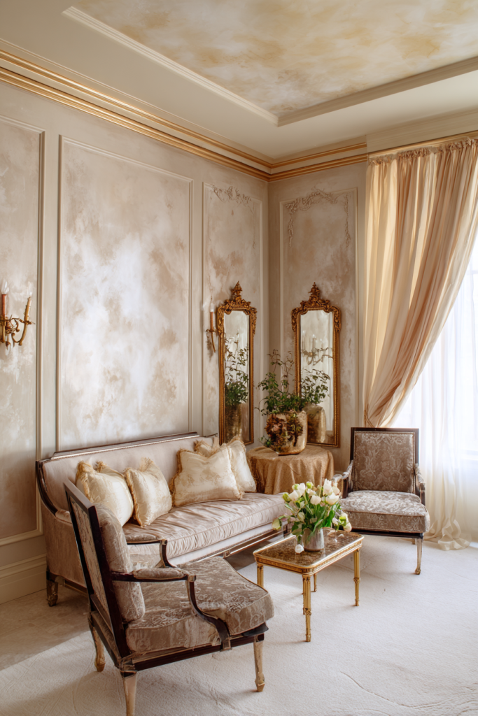
18. Vertical Color Gradient
Vertical color gradients add height and drama to rooms by transitioning colors from one side of the wall to the other. Unlike ombre’s horizontal flow, this technique creates lateral movement that makes walls feel wider and adds unexpected visual interest. I love using this in narrow hallways and small spaces.
Choose two to three colors that blend well together—analogous colors on the color wheel work best. Start with your first color on one edge, your final color on the opposite edge, and blend in the center. Use a large, dry brush to feather where colors meet, working while paint is wet. This technique draws the eye horizontally across the wall, making spaces feel more expansive than they actually are.
Designer tip: Start with your darkest or most saturated color and blend toward lighter, less saturated tones for the most natural-looking gradient.
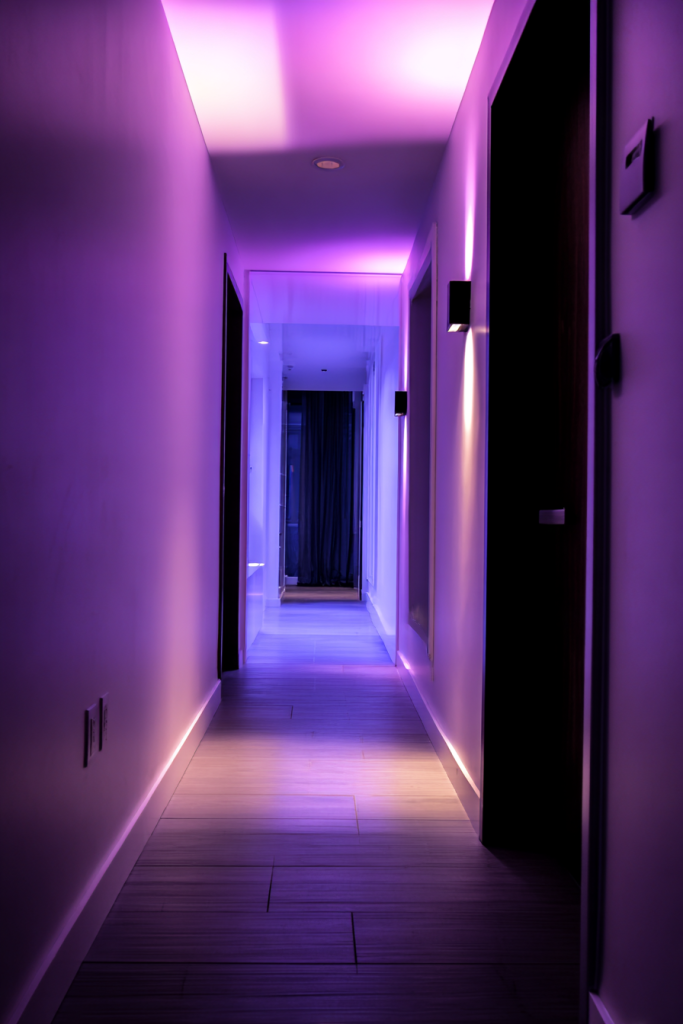
19. Herringbone Pattern
The herringbone pattern brings timeless sophistication through its distinctive V-shaped weaving pattern. While traditionally seen in flooring and textiles, this classic pattern translates beautifully to walls. I find it adds architectural interest and movement without overwhelming spaces.
Create this pattern using painter’s tape to map out your design—measure carefully for consistent angles. The classic herringbone uses a 45-degree angle, but you can adjust for different effects. Paint alternating sections in two colors or use varied shades of the same color for subtle sophistication. Metallic paint in one section adds contemporary glamour. This technique requires patience and precision but delivers striking results that feel custom and high-end.
Designer tip: Use a level and measure every tape placement—even small inconsistencies become obvious in geometric patterns like herringbone.
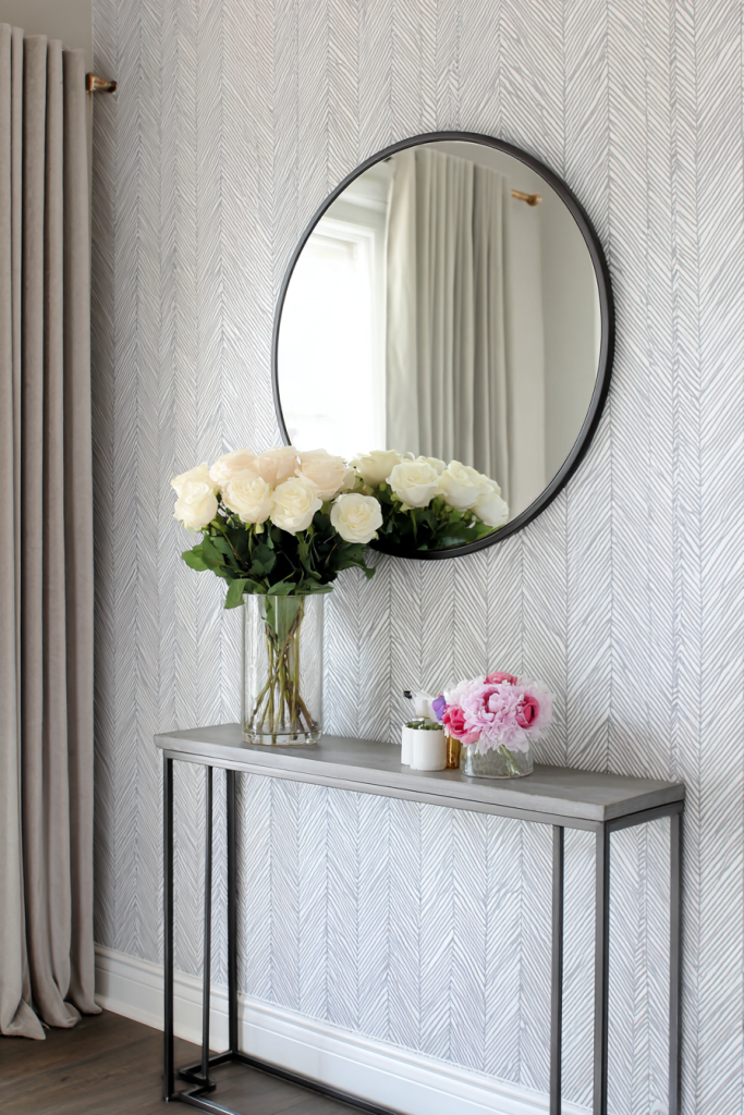
20. Sunset Sky Gradient
Sunset sky gradients bring the magical colors of golden hour into your home, creating warm, inspiring spaces that change throughout the day as natural light shifts. This romantic technique layers warm colors—from deep orange to soft pink to golden yellow—mimicking those perfect evening skies. I love this in bedrooms and creative spaces where you want to inspire calm and creativity.
Start with your lightest color (usually yellow or pale pink) at the top, gradually transitioning through deeper oranges and pinks, possibly ending with purple or deep blue at the bottom. The key is generous blending where colors meet, using a large, dry brush to feather transitions. Work in sections and move quickly while paint is wet. Add clouds with white or cream paint using a sponge for extra dimension if desired.
Designer tip: Test your color combinations on poster board first—sunset colors can be tricky, and some combinations that seem perfect in theory look muddy in practice.
Conclusion
Transforming your walls through creative painting techniques opens up a world of possibilities for personalizing your space without major renovation costs. From the dreamy softness of watercolor washes to the bold drama of geometric patterns, these 20 ideas offer something for every style, skill level, and budget. I’ve seen how the right wall treatment can completely shift the energy of a room, making it feel larger, cozier, more sophisticated, or more playful.
Remember that the best wall painting project is one that reflects your personality and lifestyle. Don’t be afraid to experiment with techniques on sample boards before committing to full walls. Mix and match ideas to create something uniquely yours—perhaps combining sunset gradients with metallic accents, or pairing geometric patterns with textured finishes.
The beauty of paint is its forgiving nature—if you don’t love the results, you can always repaint. Start with smaller, less prominent walls to build confidence, then tackle those larger, more visible spaces. Gather inspiration, trust your instincts, and most importantly, have fun with the creative process. Your walls are waiting to tell your story—what will yours say?
FAQ Section
Q: How much paint do I need for these wall painting techniques?
A: Most rooms require about one gallon of paint per 400 square feet for a single coat, but textured techniques like sponge painting or ombre effects typically need 20-30% more paint due to layering. I always recommend buying an extra quart beyond your calculations for touch-ups and corrections. Darker colors and techniques involving multiple layers may require additional paint compared to simple, single-coat applications.
Q: Can I create these effects in rental properties without losing my security deposit?
A: Absolutely! Most landlords allow painting as long as you return walls to their original color before moving out. Keep paint samples of the original wall color for easy matching later. Some techniques like chalkboard paint or bold murals might require explicit permission, so always check your lease agreement first. Alternatively, consider removable wallpaper or washi tape designs for completely commitment-free wall transformations.
Q: What’s the best way to achieve professional-looking results as a beginner?
A: Preparation is everything—clean walls, quality painter’s tape, and proper priming make the biggest difference in final results. Start with simpler techniques like two-tone walls or color blocking before attempting complex gradients or stenciling. Practice your technique on poster board first to get comfortable with the process. Invest in quality brushes and rollers rather than bargain options, as they provide better coverage and smoother finishes that look more professional.
Q: How long do these painted wall treatments typically last?
A: With proper surface preparation and quality paint, most wall painting techniques last 5-7 years before needing touch-ups or repainting. Textured techniques like venetian plaster or faux concrete may last even longer—up to 10 years—due to their durable finishes. High-traffic areas like hallways and children’s rooms may show wear sooner, while protected spaces like adult bedrooms often look fresh for many years. Using washable paint formulas and applying clear protective top coats can extend the life of your wall treatments significantly.

