
I’ll never forget the moment I walked into my friend’s newly painted living room last spring. The walls were bathed in the most gorgeous warm white I’d ever seen – it was like stepping into a serene, sophisticated sanctuary that somehow felt both cozy and spacious at the same time. That’s the magic of choosing the right neutral paint color for your living room.
As someone who’s helped transform countless living spaces over the years, I’ve learned that neutral paint colors are far from boring. They’re actually the secret weapon of interior design – providing the perfect foundation for any style, from minimalist modern to cozy farmhouse. The beauty of neutrals lies in their versatility; they can serve as a calming backdrop for bold furniture and artwork, or create stunning monochromatic schemes that exude quiet luxury.
Whether you’re dealing with a small apartment living room that needs to feel larger, or a spacious family room that requires warmth and intimacy, the right neutral can completely transform your space. I’ve discovered that the key isn’t just picking any neutral – it’s understanding undertones, lighting, and how different shades interact with your existing furnishings.
In this comprehensive guide, I’m sharing my top 13 neutral paint colors that have consistently delivered stunning results in living rooms of all sizes and styles. From classic whites that never go out of style to sophisticated grays and warm beiges, you’ll discover exactly which shades work best for different lighting conditions, design aesthetics, and personal preferences. Plus, I’ll share insider tips on how to choose the perfect neutral for your unique space.
1. Pure White: The Ultimate Canvas
Crisp White for Maximum Brightness
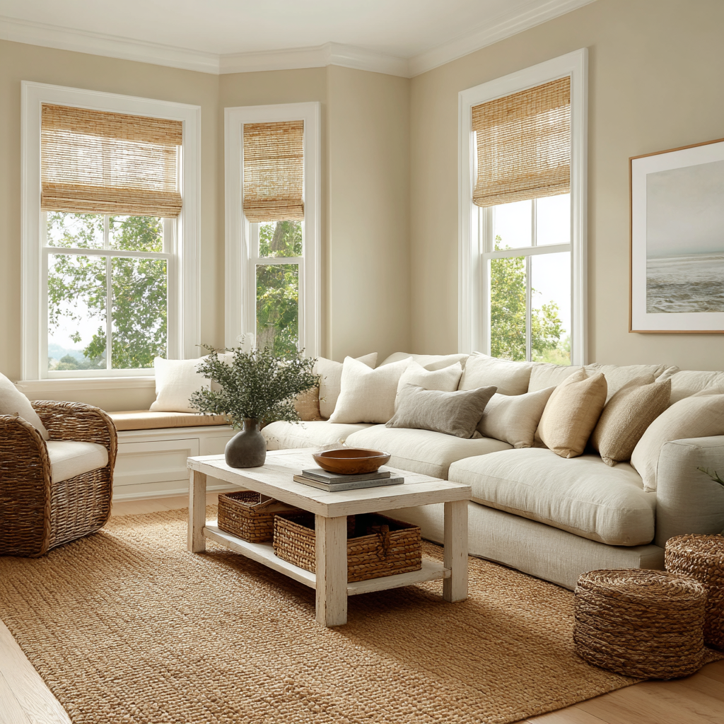
Pure white remains my go-to recommendation for living rooms with abundant natural light and modern aesthetics. This shade creates an instant sense of spaciousness and provides the perfect backdrop for statement furniture and bold artwork. I particularly love how pure white reflects light throughout the day, creating dynamic shadows and highlights that add visual interest without competing colors.
The key to success with pure white is ensuring your room has adequate natural light – otherwise, it can feel stark or clinical. I always recommend testing paint samples on different walls throughout the day to see how the light changes the appearance. Pair pure white walls with rich textures like chunky knit throws, natural wood furniture, and layered rugs to prevent the space from feeling cold.
Designer tip: Choose pure white when you want to showcase colorful art collections or frequently change your decor seasonally.
2. Warm White: Cozy Elegance
Soft Ivory Tones for Intimate Spaces
Warm white, particularly in ivory tones, has become my secret weapon for creating inviting living rooms that still feel fresh and sophisticated. Unlike stark white, warm white has subtle yellow or cream undertones that add depth and prevent the harsh, sterile feeling that can occur in rooms with limited natural light.
I’ve found that warm white works beautifully in both traditional and contemporary settings. It pairs effortlessly with brass fixtures, natural wood tones, and earth-based color palettes. The subtle warmth makes furniture and textiles appear more inviting, while still providing that clean, neutral foundation that makes rooms feel larger.
This shade is particularly effective in north-facing rooms or spaces with smaller windows, where pure white might feel too cold. I often recommend warm white for families with young children, as it’s forgiving with fingerprints and daily wear while maintaining an elegant appearance.
3. Cream: Rich and Inviting
Luxurious Warmth with Sophisticated Appeal
Cream paint colors offer more personality than traditional whites while maintaining that essential neutral versatility. I’ve used various cream shades in dozens of projects, and they consistently create a sense of luxury and comfort that pure whites simply can’t match. The subtle yellow undertones in cream paint make spaces feel warmer and more welcoming.
What I love about cream is its ability to complement both warm and cool accent colors. It serves as a beautiful foundation for jewel tones like emerald green or sapphire blue, while also harmonizing perfectly with earthy browns, soft pinks, and sage greens. The richness of cream paint also helps hide minor wall imperfections better than stark white.
I particularly recommend cream for living rooms with vintage or traditional furniture, as it enhances the warmth of wood finishes and creates a cohesive, timeless look. The key is choosing a cream with balanced undertones – avoid anything too yellow, which can appear dated.
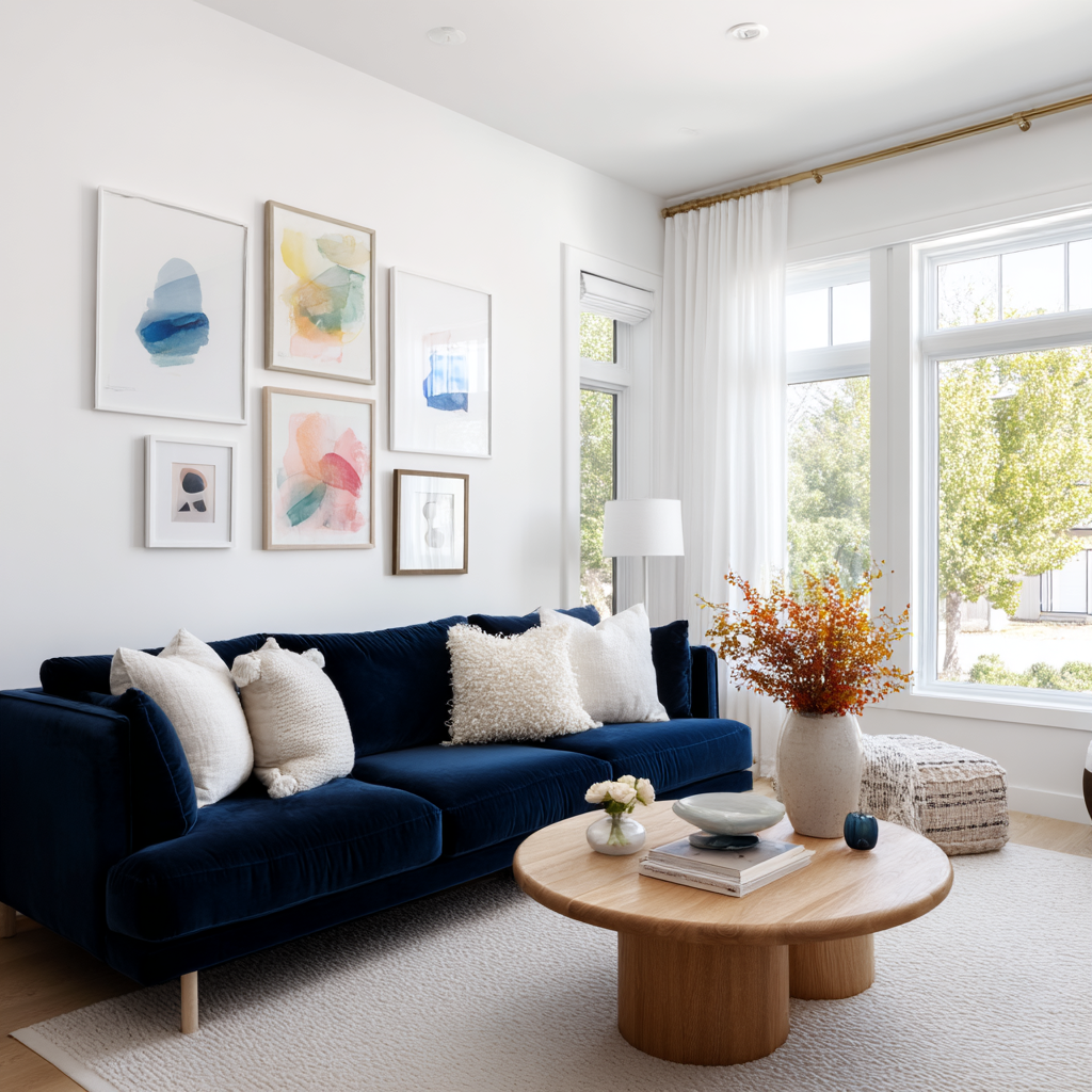
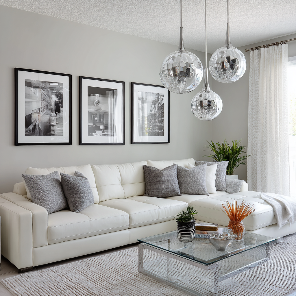
4. Light Gray: Modern Sophistication
Cool Tones for Contemporary Aesthetics
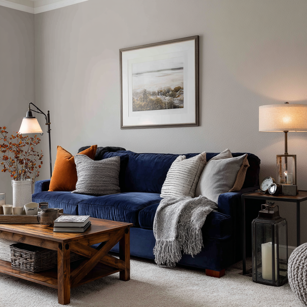
Light gray has revolutionized the way I approach neutral paint colors in living rooms. This sophisticated shade offers the perfect balance between white and deeper grays, creating a contemporary backdrop that feels both calming and current. I’ve noticed that light gray works particularly well in open-concept homes where the living room flows into other spaces.
The beauty of light gray lies in its ability to make colorful furniture and artwork pop while maintaining a serene, uncluttered feeling. I often pair light gray walls with white trim for a crisp, architectural look, or with darker gray accents for a more monochromatic approach. This color works exceptionally well with stainless steel appliances, chrome fixtures, and glass accessories.
One thing to watch for with light gray is undertones – some lean blue, others lean green or purple. I always recommend testing samples in different lighting conditions, as these undertones can become more pronounced under artificial light.
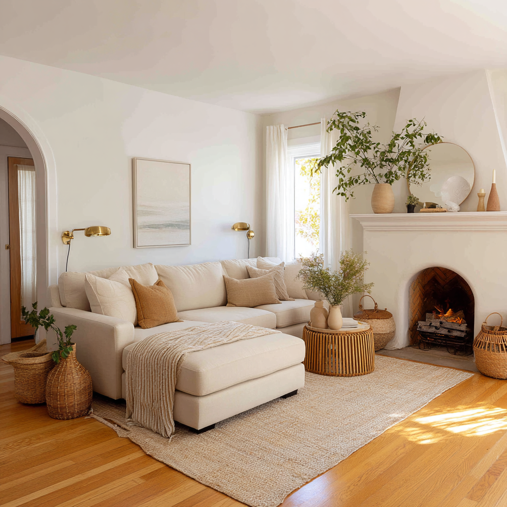
5. Soft Beige: Timeless Comfort
Natural Warmth with Universal Appeal
Soft beige continues to be one of my most requested paint colors because it creates an instantly comfortable, lived-in feeling that works with virtually any decorating style. This warm neutral has just enough color to feel interesting while remaining subtle enough to serve as a backdrop for bolder design elements.
I particularly appreciate how soft beige enhances natural materials like linen, jute, and unfinished wood. It creates a seamless flow between indoor and outdoor spaces, making it perfect for living rooms that open onto patios or have garden views. The earthy quality of beige also makes it an excellent choice for rooms with lots of plants or natural elements.
The versatility of soft beige extends to its compatibility with both warm and cool color schemes. I’ve successfully paired it with everything from coral and turquoise to navy and forest green. The key is choosing a beige with neutral undertones rather than one that leans too pink or yellow.
6. Greige: The Perfect Hybrid
Gray Meets Beige for Ultimate Versatility
Greige has become my answer to clients who can’t decide between gray and beige – and honestly, it’s often the perfect solution. This sophisticated blend combines the coolness of gray with the warmth of beige, creating a neutral that works beautifully in both traditional and contemporary settings.
What makes greige so successful is its chameleon-like quality. In morning light, it may appear more gray, while evening light brings out the beige undertones. This subtle shift adds visual interest throughout the day without being distracting. I’ve found that greige works particularly well in homes with mixed metal finishes, as it complements both warm brass and cool chrome equally well.
The balanced nature of greige makes it an excellent choice for open floor plans where you need a color that works with multiple furniture styles and room functions. It’s sophisticated enough for formal entertaining yet comfortable enough for family movie nights.
7. Pale Taupe: Subtle Sophistication
Earthy Elegance with Depth
Pale taupe occupies a special place in my neutral palette because it offers more character than typical beiges while remaining wonderfully subtle. This complex color combines gray, brown, and sometimes hints of purple or pink, creating a sophisticated backdrop that adds depth without overwhelming the space.
I’ve discovered that pale taupe works exceptionally well in rooms with architectural details like crown molding or built-ins, as it enhances these features without competing for attention. It’s also forgiving with furniture in various wood tones, from light oak to deep walnut, making it perfect for rooms with inherited or mixed furniture pieces.
The earthy quality of pale taupe makes it particularly suitable for creating cozy, cocoon-like living spaces. I often recommend it for rooms where people spend a lot of time reading or relaxing, as it creates a calming, nurturing environment. Pair it with soft textures and natural materials for maximum impact.
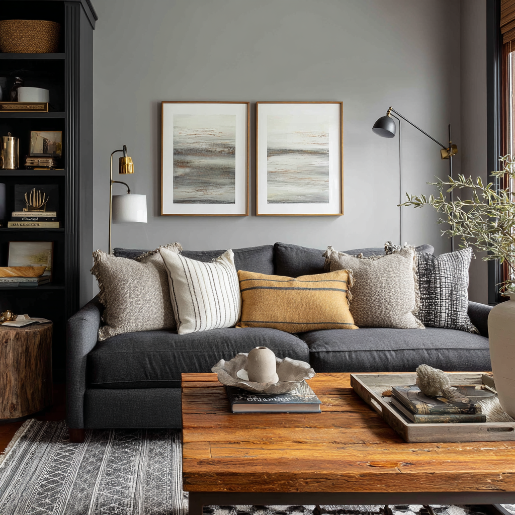
8. Medium Gray: Bold Yet Balanced
Statement-Making Neutrals with Confidence
Medium gray has become my choice for clients who want to make a sophisticated statement without committing to dark, dramatic colors. This deeper neutral creates instant depth and visual interest while maintaining the versatility that makes neutrals so appealing. I’ve found that medium gray works particularly well in large living rooms where lighter colors might feel washed out.
The key to success with medium gray is balancing it with lighter elements to prevent the space from feeling too enclosed. I always recommend pairing it with white or cream trim, light-colored furniture, and plenty of metallic accents to add brightness. This color also serves as an excellent backdrop for both colorful artwork and monochromatic design schemes.
I particularly love medium gray in homes with lots of natural wood, as it creates a beautiful contrast that highlights the warmth of the wood tones. It’s also perfect for accent walls when you want to create a focal point without using bold colors.
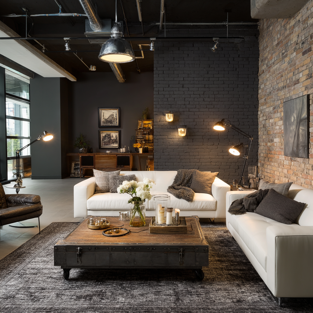
9. Charcoal Gray: Dramatic Elegance
Rich Depth for Statement Spaces
Charcoal gray pushes the boundaries of what many consider “neutral,” but I’ve used it successfully in numerous living rooms to create stunning, dramatic spaces. This deep, rich color works best as an accent wall or in rooms with exceptional natural light, where it can create a cozy, intimate atmosphere without feeling oppressive.
The beauty of charcoal gray lies in its ability to make other colors appear more vibrant by contrast. I’ve paired it with crisp whites, warm creams, and even bold jewel tones with incredible results. It’s particularly effective in modern and industrial-style interiors, where it can enhance exposed brick, concrete, or metal elements.
When using charcoal gray, I always ensure there’s plenty of ambient and task lighting to prevent the space from feeling too dark. Strategic placement of mirrors and light-colored furniture helps maintain balance while preserving the sophisticated, moody atmosphere this color creates.
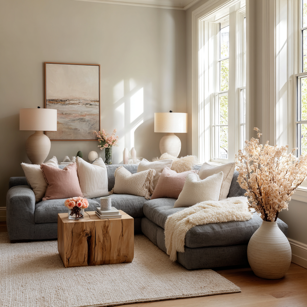
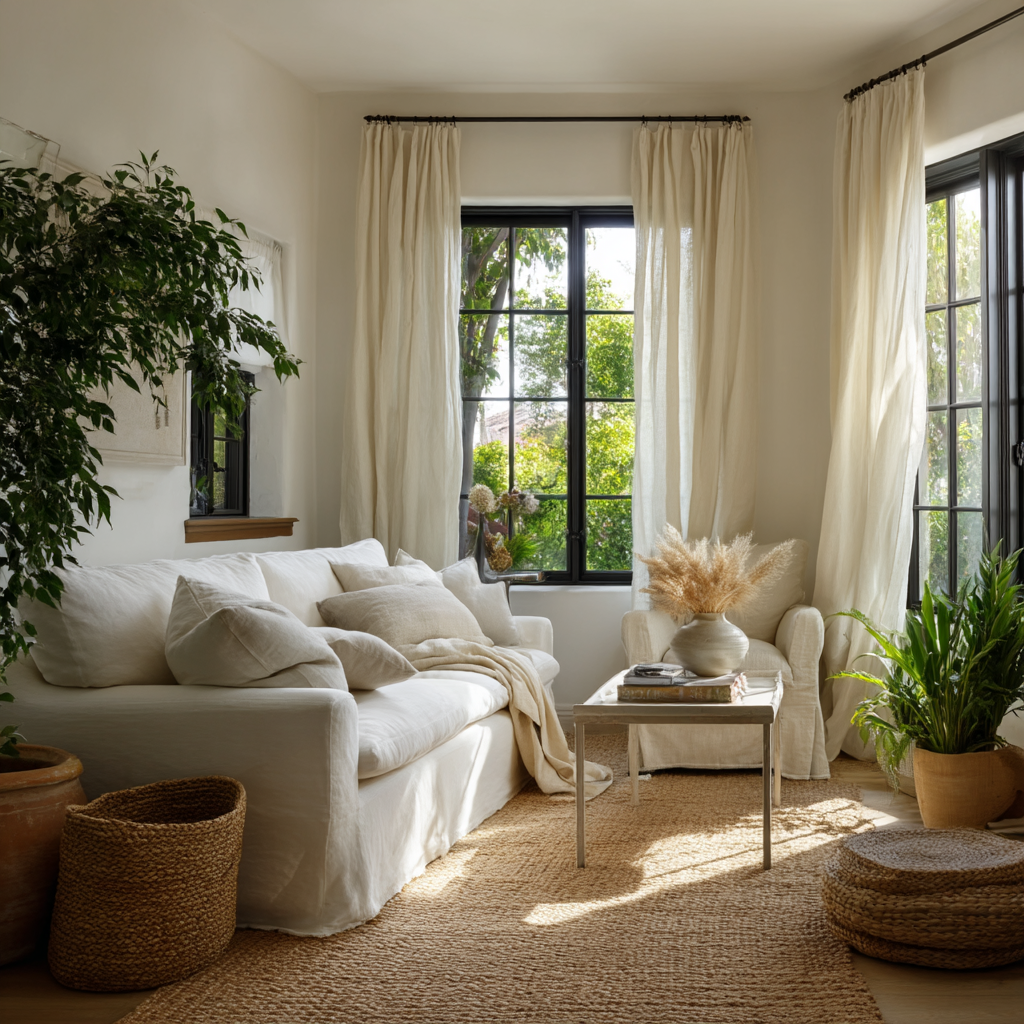
10. Soft Off-White: Gentle Perfection
Barely-There Color with Maximum Impact
Soft off-white occupies the sweet spot between pure white and cream, offering just enough warmth to feel inviting without any noticeable color undertones. I’ve come to rely on this shade for clients who want the freshness of white but find pure white too stark for their lifestyle or lighting conditions.
This subtle neutral works beautifully in both traditional and contemporary settings, serving as a perfect backdrop for any design style. I particularly appreciate how soft off-white enhances natural textures like linen, cotton, and unfinished wood without competing for attention. It creates a serene, spa-like atmosphere that many of my clients find deeply relaxing.
The versatility of soft off-white extends to its compatibility with virtually any accent color. Whether you prefer soft pastels, bold brights, or rich jewel tones, this neutral provides the perfect foundation. It’s also forgiving with everyday wear and tear, making it ideal for busy family living rooms.
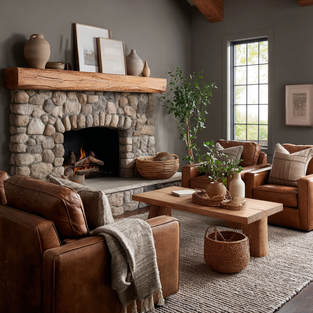
11. Mushroom Gray: Earthy Sophistication
Nature-Inspired Neutrals with Warmth
Mushroom gray, with its subtle brown undertones, has become one of my favorite “secret weapon” colors for living rooms that need to feel both sophisticated and grounded. This complex neutral combines the coolness of gray with earthy brown notes, creating a color that feels connected to nature while remaining elegantly refined.
I’ve found that mushroom gray works exceptionally well in rooms with lots of natural materials – think leather furniture, wooden beams, stone fireplaces, or jute rugs. It enhances these organic elements while providing a calming, neutral backdrop that doesn’t compete for attention. The color also pairs beautifully with both warm and cool metals.
This shade is particularly effective in creating cozy, cocoon-like spaces where people want to unwind and relax. I often recommend it for family rooms or casual living spaces where comfort is the primary goal, as it creates an instantly welcoming atmosphere that feels like a warm hug.
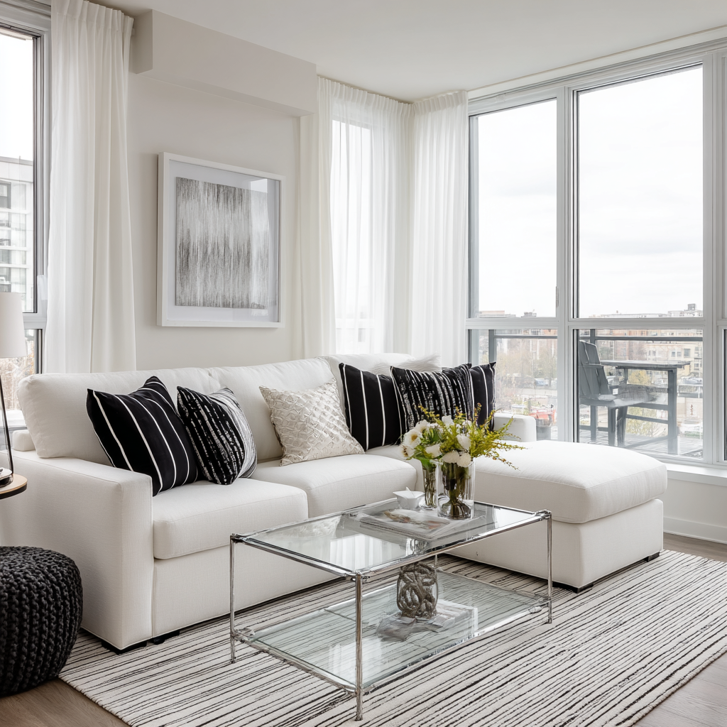
12. Cool White: Fresh and Airy
Crisp Clarity for Light-Filled Spaces
Cool white, with its subtle blue or gray undertones, creates an incredibly fresh, clean feeling that works beautifully in contemporary and coastal-inspired living rooms. I love recommending this shade for homes with abundant natural light, where the cool undertones create a refreshing, almost ethereal quality throughout the day.
The appeal of cool white lies in its ability to make spaces feel larger and more open while maintaining a sophisticated, gallery-like quality. I’ve used it successfully in minimalist interiors where the focus is on clean lines and uncluttered aesthetics. It also serves as an excellent backdrop for black and white photography or modern art.
When working with cool white, I always ensure the space has adequate warmth through textiles, lighting, and natural materials to prevent it from feeling sterile. Adding elements like warm wood tones, soft throws, and layered lighting helps create the perfect balance between fresh and inviting.
13. Warm Gray: Cozy Contemporary
The Perfect Balance of Modern and Inviting
Warm gray rounds out my list as the ultimate compromise between contemporary style and cozy comfort. This sophisticated neutral has subtle brown or beige undertones that prevent it from feeling cold or sterile, making it perfect for families who want a modern look without sacrificing warmth and livability.
I’ve discovered that warm gray works beautifully with both traditional and contemporary furnishings, making it ideal for homes where different design styles need to coexist harmoniously. It complements wood tones beautifully while also pairing well with metals, glass, and modern materials. The versatility makes it a safe choice for long-term satisfaction.
This color is particularly effective in open-concept homes where the living room flows into other spaces, as it provides continuity without being boring. I often recommend warm gray for clients who entertain frequently, as it creates a sophisticated backdrop that photographs beautifully while feeling comfortable for everyday living.
Conclusion
Choosing the perfect neutral paint color for your living room doesn’t have to be overwhelming. Throughout my years of designing spaces, I’ve learned that the best neutral is the one that feels right for your specific situation – your lighting conditions, lifestyle, and personal aesthetic preferences all play crucial roles in making the right choice.
Remember that undertones matter just as much as the primary color, and what looks perfect in one room might not work in another due to different lighting conditions. I always encourage my clients to test their top choices on the wall for at least a week, observing how the color looks throughout different times of day and under various lighting conditions.
The beauty of neutral paint colors lies in their longevity and versatility. Whether you choose a crisp white for maximum brightness, a warm beige for cozy comfort, or a sophisticated gray for contemporary appeal, you’re investing in a backdrop that will serve you well for years to come. These colors provide the perfect foundation for expressing your personal style through furniture, artwork, and accessories – elements that are much easier to change than wall color.
Frequently Asked Questions
How do I choose between warm and cool neutral paint colors?
The choice between warm and cool neutrals depends primarily on your room’s natural lighting and your desired atmosphere. Cool neutrals (whites with blue or gray undertones, pure grays) work best in south-facing rooms with abundant natural light and contemporary design schemes. Warm neutrals (creams, beiges, warm grays) are ideal for north-facing rooms with limited light and traditional or cozy design styles. Consider your existing furniture and fixtures too – warm wood tones pair beautifully with warm neutrals, while sleek metals complement cool tones.
What’s the best neutral paint color for a small living room?
For small living rooms, I typically recommend lighter neutrals like pure white, soft off-white, or light gray to maximize the sense of space and brightness. These colors reflect light effectively, making rooms appear larger and more open. However, don’t automatically dismiss slightly deeper neutrals like warm gray or pale taupe – when paired with adequate lighting and light-colored furniture, they can actually make a small room feel more cozy and intentional rather than cramped.
How much does it typically cost to paint a living room with neutral colors?
The cost of painting a living room varies significantly based on room size, paint quality, and whether you hire professionals or DIY. For a standard 12×15 living room, expect to spend competitive price rangefor high-quality paint and supplies if doing it yourself, or competitive price range,500 for professional painting. Premium neutral paint colors from brands like Benjamin Moore or Sherwin-Williams typically competitively priced-70 per gallon, and most living rooms require 2-3 gallons including primer. Remember that investing in quality paint pays off with better coverage, durability, and color retention.
Can I use multiple neutral colors in the same living room?
Absolutely! Layering multiple neutrals can create incredibly sophisticated and visually interesting spaces. The key is ensuring they share similar undertones – pair warm neutrals with other warm neutrals, and cool with cool. I often use a lighter neutral on the main walls with a slightly deeper shade on an accent wall, or incorporate different neutrals through trim, built-ins, and architectural details. This approach adds depth and dimension while maintaining the serene, cohesive feeling that makes neutral color schemes so appealing.